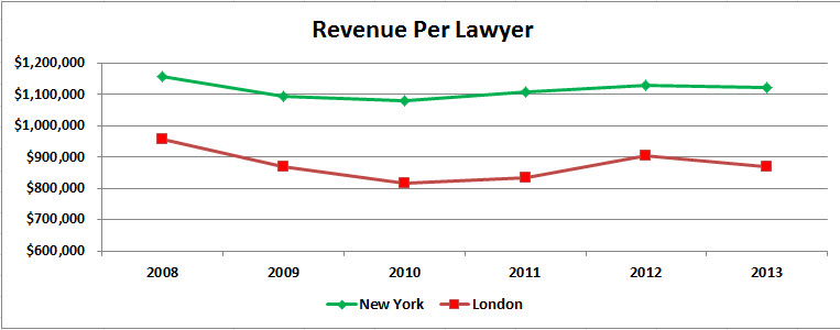
This is the first chart we’ve seen where New York’s green line lies above London’s red line. And I would posit the difference is material: London essentially not above $900,000 and New York essentially not below $1.1-million, or nearly a 25% difference on average.
The next chart is one for which, before creating it, I had low expectations. I expected it to be uninformative. But look:
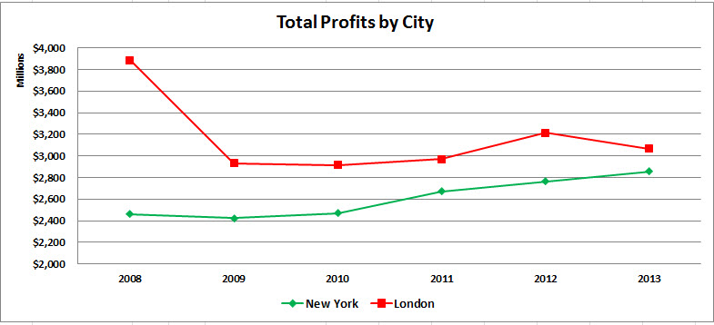
This may be the most dramatic change we see in any of these charts: London’s total profit went from over 150% of New York’s in 2008 to about 110% for the five-year period 2009—2013. And if you look back at the second chart (total number of lawyers by city), you see no comparable change in headcount that would otherwise account for this, all else being equal. London went from about 195% of New York’s headcount in 2008 to about 160—165%.
Now, one you’ve doubtless been waiting for:
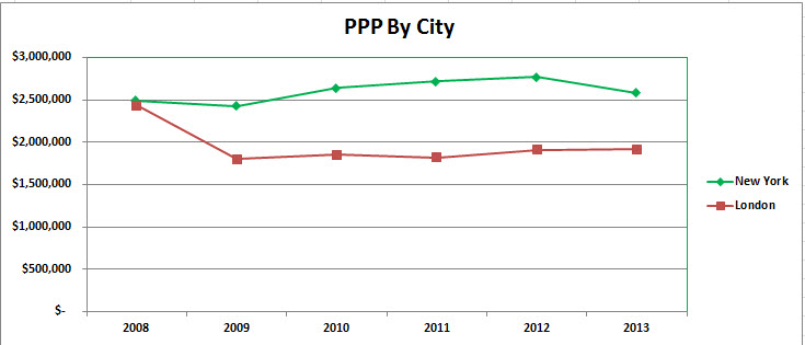
A dead tie in 2008 to a fairly steady run in 2009—2013 of New York above London by about $2.6—$2.7-million to $1.8-million, or about 50% higher. Over time, this is the kind of gap people with options begin to notice.
Next, we have:
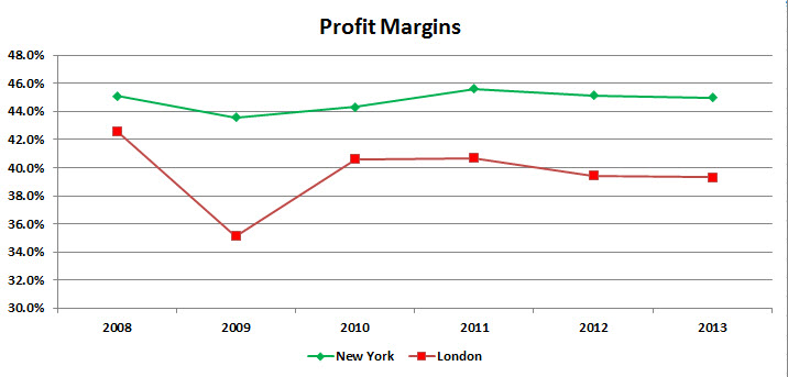
Respected economists, business school professors, and just plain hard-headed CEO’s might tell you that to them this is the most informative chart of all: That New York has remained steadily in a range of 44—46% margins while London has been more volatile but has leveled off at about 40% (12% lower) means that New York firms have more resources year upon year to invest in the organization, pay for talent, and so on. As with PPP, over time this kind of gap begins to tell.
But the next thing all those imaginary observers would focus on is why such a difference exists and whether it refects intrinsic and enduring competitively differentiating strengths or whether it’s merely a creature of a particular time and temporary circumstance or even (worse) reflects short-term profit extraction and maximization at the cost of mortgaging investments in future opportunities.
I think the primary answer may be quite a bit simpler: By and large, the New York firms derive the vast majority of their revenue from New York-centric work, whereas the Magic Circle have far more widespread geographic footprints with proportionately much more of their revenue generated outside the high-margin precincts of Manhattan and the Square Mile.
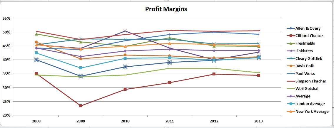
To see this more vividly, let’s disagregate these groupings of “New York” and “London” and break out firm by firm performance (here’s one chart in particular you might want to click on to see full size):
Indeed, Freshfields and Linklaters have embarked on a more selective, more tightly focussed, and frankly more rigorous performance-driven reconfiguration over the past several years, while Allen & Overy and Clifford Chance have continued to expand their office networks to follow clients globally. Debating which structure is “right” or “superior” can be a source of endless entertainment, but for present purposes it comes as no surprise that the consequences of these choices are on display in this very chart.
I’ve provided a fair amount of data for you here, and you may be wondering what particular aspects of it I think really matter.



Very interesting – thank you!
Do you think that the figures are (heavily) impacted by currency fluctuations between 2008 and 2013?
You’re welcome!
The short answer, to my mind, about currency fluctuations is:
My bottom line is: Can’t do anything about them, so let’s ignore them.
How do the numbers differentiate (or do they) between compensation paid to equity partners as profit v. salary treated as an expense? Is everything paid to an equity partner treated as profit?
On a less serious note, any post that references Warner Wolf is ++ in my book. Now if you can somehow work in a reference to Jerry Girard we’d really be talking.
Unfortunately you’ve completely ignored the fact that the pound –the billing currency of the lion’s share of magic circle ops — was at multidecade highs of over $2:£1 in 2008, then fell back by about 25%, with high volatility (like all financial markets!). This by itself accounts for most of the trend in several of the charts you put forth which measure performance in dollars. Of course New York looks less volatile when you measure things in US currency! Of course the Magic Circle declines during years when GBP declines! It’s a shame you didn’t think to address this variable since it is a far more significant determinant than any of the theories you put forth in your article.
I actually used each year’s average GBP/USD exchange rate for that year, as opposed to one average over the entire period. That’s the methodology.
As for the substance of your observations, let us stipulate that the currency movements you posit are correct. What, then, is one to do in terms of analysis? I don’t think the managing partners of any of the firms identified in the piece would suggest they be ignored, or can be ignored in real life when it comes to partner compensation time. At the risk of being simplistic, yes indeed currencies fluctuate. It strikes me as a hard fact on the ground that one simply has to build into any crossborder analysis of this sort. I don’t see any alternative route.
You finish this with the question “What do you think this lineup will look like in 2020?” Might now be a suitable time to revisit?
In ordinary days, you would not be wrong, but given what’s going on in the world this year I think it only prudent to table this until we emerge on the other side, either via universal vaccine or brute-force herd immunity, which some elected leaders seem to be pursuing in deed if not in word.