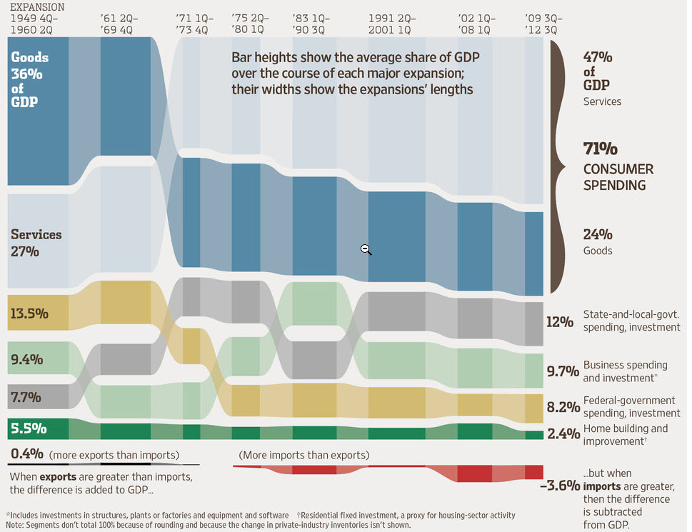
First up, and these are all courtesy of the WSJ’s Top 10 Economic Charts of 2012, here’s a snapshot of the composition of US GDP from the post-WWII era to today.
There are a couple of large stories told here. First, the relative share of goods and services have swapped places since 1949: Goods used to absorb 36% of GDP and services 27%, and now the ratio is more than turned on its head, with goods at 24% and services at 47%.
Federal and state spending have also swapped places, with federal declining from its post-WWII/Cold War high and state and local growing, although their combined share has stayed remarkably constant (21.2% in 1949, 20.2% today).
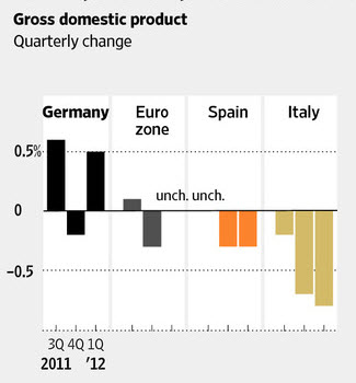
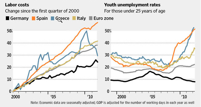
Now let’s look at another major economy, Germany’s. If you had the impression it’s the economic engine of the Eurozone, you would be right. In spades. The cumulative message of these charts comes through loud and clear.
It’s an awful time to be a worker in Spain, Greece, or Italy—and horrendous if you’re under 25.
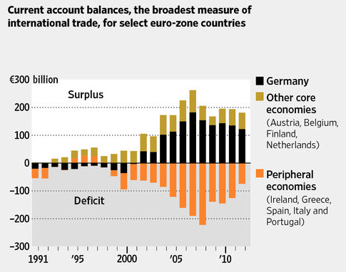
The combined impact of the first two charts expresses itself in this one, which shows Germany’s strongly growing economy and controlled labor costs contributing to a growing surplus in its current account (the broadest measure of international trade). My surmise is that the only reason the “peripheral economies” deficits have begun to shrink is that their overall level of economy activity is depressed.
Lest you think this is all a merely academic exercise in comparative macroeconomics, it’s not. These charts tell a powerful story about where you should be investing your practice area and geographic resources—at least if you believe in following the money.


